|
|
Post by Zephron on Jun 27, 2009 12:13:59 GMT -6
These are all my photoshop sigs I've made in my lifetime, including Brawl textures.
I was bored, and decided to post it. I decided to post them all so you guys can see the progression of my work. You can tell which one was made before the other, but I tried to organize them some way.
I also commented on them.
Click this for my texture gallery: kittycorpforum.xtreemhost.com/index.php?topic=199.0
(You may have to register... but please do, my textures are worth seeing, I think.)
Newest stuff:

HanZo's sig. He wanted it blue, so I made a blue version.

This would've been the final version if HanZo had not asked me why Falco had a flamethrower XD
Whoops. Guess I should make a blue one.

I really like this. Not too good on flow, but the lighting is pretty good, and I love the technology interface with the monster, and it just looks nice.

I make texture hacks so I made this sig for my Meowmix team page. I love apple and stuff so it was a 30 min fun sig.

^ First sig... cheesy but nice imo.

Okay this was was first but I didn't use photoshop so I kind of just dont count it as a sig 

This was so epic. I just started animating and it took my like 3 days but its still uber awesome to me.

Made it for an old friend.

Used to use TL

Used to use Sheik.

Mah current avy! 

( Site was gray background back then )


You have no idea how long that freaking animation took.

My irl best friend's sig.

(I really didn't like it but Jaguar was cool and loved it for some reason.)

Used to main Zelda.

An avatar I made for a close friend.

Our old banner.

I have no clue when I made this one so it's in the back. Was pretty early though.

Plaid's actual avatar. Idk why his isn't working.

I still love this. So darn epic. Epic fail guard btw. XD

My fav. Lucas sig!
That's all I'm going to bother scrounging out for now. Hope you guys enjoyed it.
|
|
|
|
Post by Mac on Jun 28, 2009 1:53:12 GMT -6
Peach sig plz. Preferably in her blue costume. I pay with gratitude.
Even better would be a sig with both blue Peach and red Marth, and throw Mac or Mac Royale somewhere on it.
|
|
KSpam
Senior Member
 Puts the G back in Grandma
69%
Posts: 449
|
Post by KSpam on Jun 28, 2009 18:28:19 GMT -6
Could you do a Kirby sig that looks like it came straight out of H.P. Lovecraft?
|
|
|
|
Post by Zephron on Jun 28, 2009 18:56:20 GMT -6
Lol, this is a gallery not a sigshop. Though I appreciate it.
I have 3 rules for people asking for sigs. (Please actually read these if you plan on asking for one.)
1.) I only have 1 character per sig.
Why? Each character has his/her own style and look. Consider Peach and Marth. They both look completely different. One is cartoony, the other is very detailed anime with swords. The mario world has no weaponry besides feet and hammers, on occasion. Their styles and color themes clash, and this takes away from a balanced sig.
Also having two focal points makes the sig look bad, and it makes flow terrible and nonexistant.
2.) Fill out this:
Character:
Color Scheme:
Appx. Size:
Optional Specific Details:
Here's what you basically fill in:
Character: Peach
Color Scheme: Blue, Pink, and Purple
Appx. Size: About the size of your Samus Sig
Optional Details: Use this picture for Peach yourpicturelink.com/557229p
3.) Say thanks when I give it to you, and actually use it. (You may wonder why I say that, but you have no idea how many sigs I've made where the guy never actually uses the sig I made him, then asks for another one. Pisses me off so bad.)
Also I'll make you guys's sigs once you fill out the form. Please do, the more info you give me the better I can make what you want.
I hate it when ppl tell me: "Make me a TL sig k? Kthxbye." Then I give them a blue themed sig and then they get pissed at me because blue is their least favorite color or something.
|
|
|
|
Post by Mac on Jun 29, 2009 19:51:38 GMT -6
Character: Peach (blue dress) Color Scheme: Blue, white, purple (no pink plz) Size: Typical sig size (about the size of your other art work) Optional Details: plz don't use the official SSBB Peach artwork, unless it's paired with something. Maybe you could resize and recolor this fc06.deviantart.com/fs29/f/2008/083/0/6/Brawlin___Peach_by_pixel07.jpg. Also, don't make it cute. Peach is a badass, so avoid making her all lovable and stuff. Throw my name, "Mac" or "Mac Royale" on there somewhere. |
|
|
|
Post by мғв=Bane on Jun 29, 2009 20:01:12 GMT -6
Dang, that's good. I actually have a few questions.
1) I don't have any skill with this sort of thing, what program should I use to begin practicing?
2) What is your general advice while making sigs and stuff?
3) Where would I put a sig once I create it? I know I need to upload it to the internet somewhere, but I don't exactly know where.
4) How long has it taken you to attain your skill? I abviously can't just pick up a skill level comperable to yours overnight, but I would like to know how much effort you put into this.
Thanks for helping me with my questions. I need a little help, but I think it's the whole proverbial give a man a fish/teach a man to fish thing.
|
|
|
|
Post by Zephron on Jul 1, 2009 20:52:05 GMT -6
Whoops, didn't notice you guys posted. I'll work on Mac's sig now but let me answer Bane's Q's.
•1.) I use Photoshop CS3. I really recommend it but since it costs a ton of money, and if your father or mother don't have a copy or something at work, use GIMP. Just type it in Google and download it. It's not as good but it's great since it's free...
•2.) Hmm, there are 3 important aspects to signatures people always forget. 1: Flow. Make the sig move in some direction. Not 5 directions, 1. See my later sigs, for instance, my Lucas (olive colored) sig? It's clearly going left, right? Making the sig appear to be moving makes it have more depth and appeal!
2: Make sure you have great lighting. If you have a cool background with your character, make him blend in! Don't make a dark background and have a bright character on there. Make sure he is darkened somewhat as well. This applies for anything else in the signature.
3: Make sure you give a very clear focal point. What is your eye attracted to first / most in the sig? It should be the character, not a cool effect, or some other part. You're making a signature FOR the character, so make sure the focus is on that. Just do this by making sure nothing is brighter, or more attention-grabbing than the character. Also, don't put the focal point in the center, usually it ruins the flow. Not always, but usually. On the left or right is best.
• 3.) I use Imageshack. Just google it, it's the first option. There are many other options out there, like tinypic, but I just like imageshack.
•4.) I started making sigs about a year ago. It took a long time, you can tell my first ones are kind of bad. It does take a sense of style and mind of what you're making, but overall I just found it fun to put all these thoughts and images in my head into a stylish, cool sig that represents me and what I like. Or what someone else likes, heh.
Lol, don't worry. I've had a lot of learning experiences, especially with Smashboards. The people there are both incredible and very... critical. When I showed them my sigs they generally tell me it sucks and then tell me all these things I couldn't have even thought of, but have to agree... it's weird.
I love teaching people because it helps me remember and learn things myself and I hate it when people with talent don't help me.
|
|
|
|
Post by мғв.TheOgbot on Jul 2, 2009 10:38:10 GMT -6
Any advice for me, or critic's advice on the sig I have currently?
Edit: I forgot I wasn't emergency. Uh. I'll post in tomorrow when my account isn't banned.
I'm pretty sure Og would want some advice. too.
Edit 2:
|
|
|
|
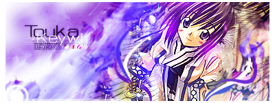
Post by Zephron on Jul 2, 2009 14:39:08 GMT -6
The text is REALLY hard to read, and that's pretty bad... You DO want me to read it, right? XD
I see Touka just fine, but Keywi (is that it?) is very hard t make out, and then the blurred text at the bottom just is too much.
The colors work together very well, but the variety all seems to be pushed to one side. Try to put some variety on the left side, too.
There is a ton going on in this sig, and it's a tad too overbearing, and bright. Looking at it, my eyes don't know where to go, really.
One eye wants to look at the text, the other wants to see your anime character, but then I blink and there's a billion effects swirling about. If you made it a bit less chaotic looking, this would help a lot.
Yeah, the problem with text is that it ruins the focal point... Unless you want the text, instead of your character to be the focal, but I don't recommend that. Text is boring. Cute Girl is win.
I am not a fan of the border... blank and white... just get rid of that. It makes the sig brighter. Seriously. If you made it black, you'd be surprised how it changes it. But I suggest removing it altogether.
As for lighting, the girl's hair has some great lighting on it, but the rest of her body is somewhat effect-less. I'd add some blue tint to her robe, perhaps.
Flow is pretty good, but as usual, the text kind of ruins it. I get the feeling it's going down to the left, but the text is still...
Don't worry about that too much though.. Text generally is a pain in the *** all the time anyway.
So basically make it much less bright and chaotic, and fix the text. (Maybe a different font... more majestic perhaps, for the theme)
As well as killing the border.
I like it a lot. I wont rate it though because people always give me crap when I do.
|
|
Smartidiot
Full Member
Om nom nom nom...
Posts: 233
|
Post by Smartidiot on Jul 2, 2009 14:56:38 GMT -6
Those are amazing o.o! They make me feel so bad about mine, it tells me I still have a long ways to go before I can even become close to good.  I also like the answers you gave Fomo, they're good tips and pointers i should be following to improve what I do. :] |
|
|
|
Post by Zephron on Jul 2, 2009 15:47:08 GMT -6
@ Smartidiot: Thanks a lot! Feel free to ask me for critiques on any sigs.
And yeah, those were good pointers. He asked good questions, though. Feel free to look back at them, or ask me other questions.
@ Mac:
Here you go Mac. I'm really sorry if it looks too girly... I saw that flower c4d and I was infatuated with it XD
Just had to put it in... if you really don't like that then feel free to tell me and I'll put in something else.
If there's anything else you want to change, TELL ME. This is YOUR sig, and I want it to be about you & your Peach.

here's the link: img196.imageshack.us/img196/7760/macroyale.png
On the plus side to make Peach more B.A I added the mummy turnip. Can't go wrong with that, right?
The flower does take a lot of attention... but it's not the focal... *sigh* I have a lot to improve on, too.
|
|
|
|
Post by мғв.TheOgbot on Jul 2, 2009 19:00:02 GMT -6
Thanks for the critic, I wish I had more of recent work uploaded, I'll show stuff once it's done and complete.
I forte in animation though.
|
|
|
|
Post by Zephron on Jul 2, 2009 19:03:43 GMT -6
Yeah not all my stuff is on here either. I've been lazy.
Honestly guys, I didn't think anyone would bother posting in this XD
Apparently you all love making sigs.
|
|
|
|
Post by мғв.TheOgbot on Jul 2, 2009 19:11:07 GMT -6
When there is a board in this forum that needs activity, Random board is the place to be.
|
|
|
|
Post by Emergency on Jul 2, 2009 19:27:19 GMT -6
I'll show you my first abomination.  It was waaaay too bright. And it doesn't show off a direct focal. ...Not to mention, flow. It was waaaay too bright. And it doesn't show off a direct focal. ...Not to mention, flow. |
|