|
|
Post by Emergency on Jul 5, 2009 14:02:36 GMT -6
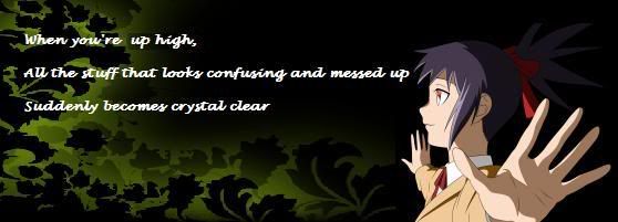
1:  2:  2b:  3:  This is a progression of the signature, I've been working on.
Any advice or changes?
I have some concerns, and would also appreciate how to cover the problem up. There is a sharp white blockish thing on the bottom center part of it. The text, I don't know where to put it. I doesn't blend well. Maybe, too many lines? |
|
|
|
Post by Zephron on Jul 5, 2009 15:15:47 GMT -6
I like #2 much better than #3.
The greens look much better than the brown scheme in #3, and I really don't like those lines at the top. I had a feeling of bottom right flow but the lines ruin it and they aren't that stylish..
I like how you got rid of the failzorz border though. That's good.
If you really do like the browns, then just ditch the lines, keep the text just like #2 except instead of red make it glow green ish yellow, maybe purple.. and give those whisp lines at the bottom either a green or a purple tint. Black doesn't look too smooth..
Otherwise it looks good! :3
|
|
|
|
Post by мғв=Bane on Jul 6, 2009 10:42:07 GMT -6
The greens look much better than the brown scheme in #3... I agree here, the brown seems really out of place. It gives it a funny unnatural feeling to it, like the person (Is that Ran Yakumo? I don't know) does not belong there. I kinda like 2 because it has a lighter background and then some darker filler effects (like the lines) to contrast. |
|
|
|
Post by Sorairo.Nia. on Jul 6, 2009 15:16:51 GMT -6
When I look at number 1, my eyes automatically goes to the text. I'm guessing here you want the viewer to look at Ran Yakumo first. Plus, the border in number 1, it's not really doing any justice here.
The second one looks to be more pleasing to the eye, but once again my eyes go automatically to the text. The good thing is that this time the text seems to go a little bit more with the composition. The other thing is that in number 2 you made the curvy lines on the right more prominent, so my eyes go around the composition instead of being stuck in just one area.
The third one, my eyes just go to the black curvy lines and stays there. The brown background looks okay. Plus the lines on top that just shoots off into space, to me it seems like a little bit much.
Out of all 3, I prefer number 2.
|
|
|
|
Post by Emergency on Jul 7, 2009 11:34:49 GMT -6
2b is completed.
|
|
|
|
Post by Sorairo.Nia. on Jul 7, 2009 12:44:44 GMT -6
2b looks great.^^
|
|
|
|
Post by Zephron on Jul 7, 2009 15:09:43 GMT -6
The text is pretty hard to read, but it does put more focus on the render, which is great.
|
|